
Colour Variation in Tiles – The Impact on Design
More than half of British homeowners report that colour variation in tiles is the key factor that brings their rooms to life. In a market where options can appear endless, choosing the right tile variation impacts not only style but also the character and warmth of a space. This guide reveals how understanding colour shifts, shade variation, and texture can help you transform your British home with confidence and original flair.
Table of Contents
- Defining Colour Variation In Tiles
- Types Of Colour Variation Explained
- Design Benefits For Uk Interiors
- Selecting The Right Colour Variation
- Common Mistakes When Using Varied Tiles
Key Takeaways
| Point | Details |
|---|---|
| Understanding Colour Variation | Colour variation in tiles reflects natural differences and contributes to visual depth, making spaces more dynamic and interesting. |
| Leveraging Variation | Designers should strategically use colour variation to enhance aesthetic appeal and complement specific design visions. |
| Lighting Considerations | Examining tile samples under various lighting conditions is essential to accurately assess colour effects within a space. |
| Avoiding Common Mistakes | Mismatched tile variations and neglected grout selection can undermine design coherence; careful planning is crucial for successful outcomes. |
Defining Colour Variation in Tiles
Colour variation represents the natural differences and subtle shifts in hue, tone, and texture that occur within tile collections. Unlike mass-produced materials that aim for perfect uniformity, tile colour variation reflects the inherent complexity of natural stone, ceramic, and porcelain tile manufacturing processes. These nuanced differences create visual depth and character that can transform a space from mundane to extraordinary.
In tile design, colour variation occurs through multiple mechanisms. Natural stone tiles like marble and travertine inherently display significant shade variation due to geological formation processes. Manufactured tiles such as porcelain tile and ceramic achieve colour variation through intentional glazing techniques, digital printing technologies, and strategic pigmentation methods. These variations range from slight variation to pronounced colour shifts within a single tile or across a tile collection, offering designers remarkable creative flexibility.
Designers and homeowners can strategically leverage tile colour variation to create visual interest. Patterned tile design techniques help highlight these natural variations and grain, transforming potential inconsistencies into intentional design features. Some tile collections deliberately emphasise colour variation as a primary aesthetic element, allowing each tile to function like a unique canvas that contributes to a dynamic overall composition.
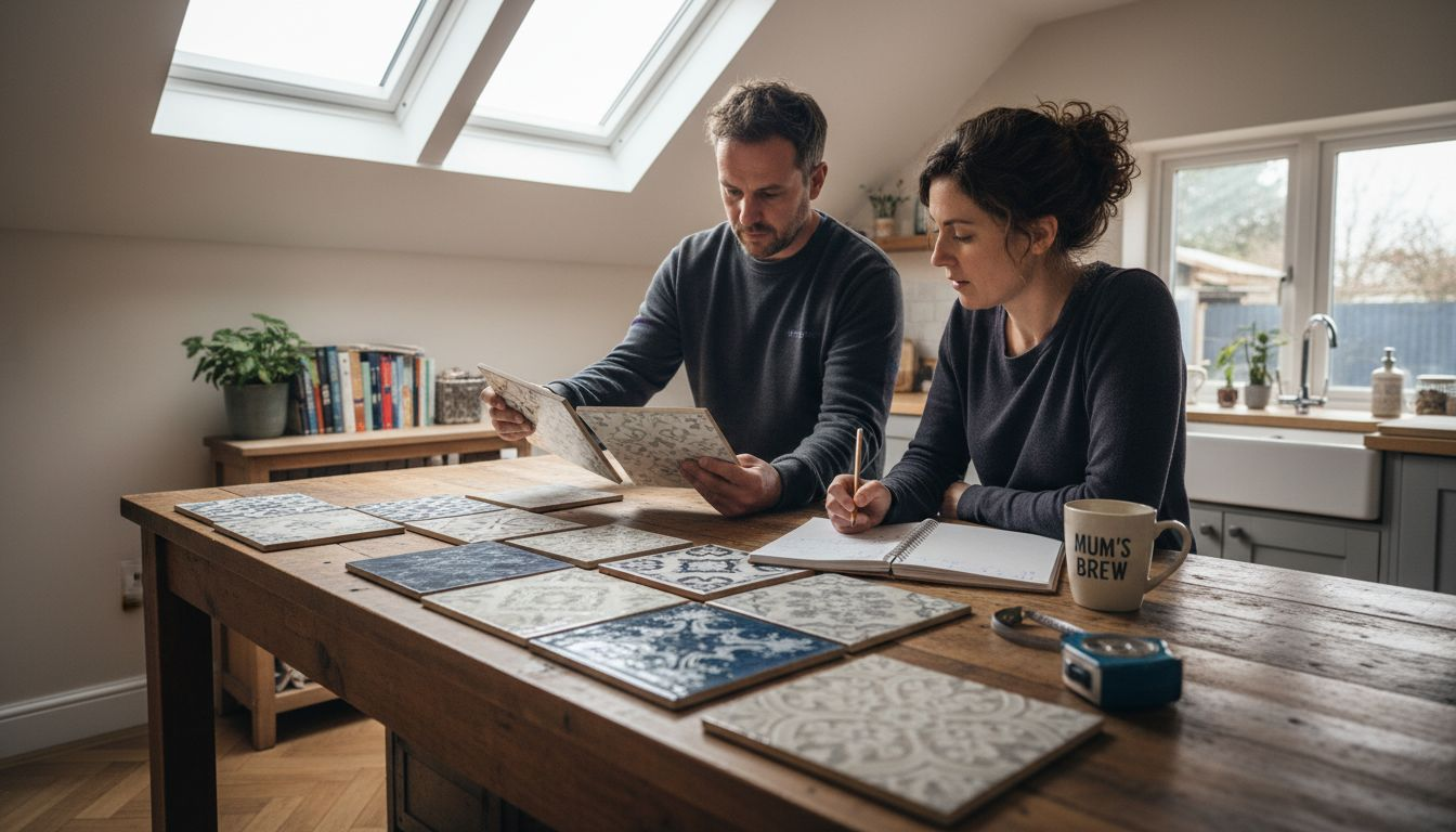
Pro tip: Tile Selection Strategy: When choosing tiles with colour variation, always view multiple sample pieces from the same batch and, if possible, different batches to understand the full range of potential visual effects and ensure they complement your specific design vision.
Types of Colour Variation Explained
Tile colour variation manifests through several distinctive categories, each offering unique visual characteristics and design possibilities. Natural materials variation represents the most organic form, where geological processes create inherent colour and texture differences. Marble, travertine, and slate stone tiles showcase remarkable variations, with each piece presenting a distinct pattern that cannot be precisely replicated.
Manufactured tiles present another fascinating spectrum of colour variation. Porcelain tiles and ceramic tiles employ sophisticated techniques to generate intentional variation. Inspiring tile pattern examples demonstrate how manufacturers create deliberate colour gradients through advanced digital printing and glazing technologies. These methods allow designers to achieve controlled variation that mimics natural stone while providing consistent quality and performance.
Tile colour variation can be categorised into specific types: uniform appearance (minimal differences), moderate variation (noticeable but balanced shifts), and substantial variation (significant colour and texture contrasts). Uniform variation typically appears in highly engineered tiles like large-format porcelain, while substantial variation is more common in natural stone and artisan ceramic collections. Each variation type offers distinct aesthetic opportunities, enabling designers to create spaces with specific visual textures and emotional resonances.
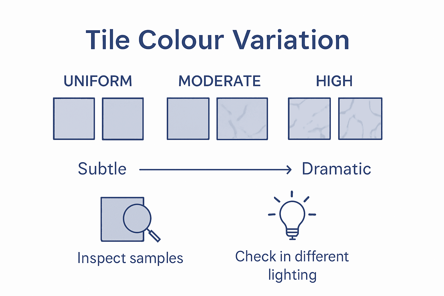
Pro tip: Variation Assessment: Always examine tile samples under different lighting conditions to fully understand their colour and shade variation characteristics and potential visual impact in your specific space.
Here’s a concise comparison of the main types of tile colour variation and their ideal uses:
| Variation Type | Visual Characteristics | Common Materials | Best Used In |
|---|---|---|---|
| Uniform Appearance | Minimal differences, consistent | Large-format porcelain tiles | Small rooms, modern spaces |
| Moderate Variation | Noticeable yet balanced shifts | Ceramic, glazed porcelain | Kitchens, bathrooms |
| Substantial Variation | Significant contrasts, unique | Natural stone, artisan ceramic | Living areas, feature walls |
Design Benefits for UK Interiors
Colour variation in tiles offers remarkable design advantages for British interior spaces, transforming ordinary rooms into extraordinary environments. Dynamic visual depth becomes achievable through strategic tile selection, allowing homeowners to create sophisticated and nuanced interior landscapes that reflect personal style and contemporary design sensibilities. Modern UK home tile trends demonstrate how colour variation can elevate interior aesthetics beyond traditional design constraints.
In British homes, where architectural styles range from Victorian terraces to contemporary urban apartments, colour-varied tiles provide exceptional design flexibility. Natural stone and ceramic tiles with subtle colour shifts can complement diverse interior palettes, from muted neutrals to bold contemporary schemes. This adaptability allows designers and homeowners to create seamless transitions between different living spaces, using tile colour variation as a sophisticated design language that communicates texture, grain, depth, and visual interest.
The psychological impact of colour variation should not be underestimated in UK interior design. Tiles with nuanced colour gradients can manipulate spatial perception, making rooms feel larger, warmer, or more intimate depending on the selected variation. Rooms featuring thoughtfully chosen colour-varied tiles can evoke emotional responses, creating environments that feel both dynamic and harmonious. By understanding and leveraging these subtle visual techniques, designers can craft spaces that are not just visually appealing but also emotionally resonant.
Pro tip: Colour Harmony Approach: When selecting colour-varied tiles, always collect multiple sample pieces and view them together under different lighting conditions to ensure a cohesive and intentional design outcome.
Selecting the Right Colour Variation
Selecting the ideal tile colour variation requires a strategic approach that balances aesthetic preferences with practical design considerations. Spatial context plays a crucial role in determining the most appropriate colour variation, with different rooms and environments demanding unique visual treatments. Comprehensive tile selection guidance emphasises the importance of understanding how colour variation interacts with existing architectural elements, surface texture, and lighting conditions.
Homeowners and designers should consider several key factors when choosing tile colour variation. Room size represents a critical consideration - smaller spaces benefit from more uniform variations that create a sense of visual continuity, while larger areas can accommodate more substantial colour shifts. Natural and artificial lighting dramatically impact how colour variation is perceived, with north-facing rooms requiring different approaches compared to sun-drenched spaces. The existing colour palette of walls, furniture, and architectural features must also be carefully evaluated to ensure harmonious integration.
Different rooms demand distinct approaches to colour variation. Bathrooms and kitchens often benefit from more controlled, subtle variations that provide visual interest without overwhelming the space. Living areas and open-plan spaces can accommodate more adventurous colour variations that create dynamic visual narratives. Considerations such as maintenance, durability, and long-term aesthetic appeal should guide the selection process, ensuring that the chosen tile variation remains visually compelling and practical for years to come.
Pro tip: Context Assessment: Always collect multiple tile samples and view them in the actual space under different lighting conditions, observing how colour variations interact with your specific environment and design elements.
Key factors to consider when choosing tile colour variation:
| Factor | Why It Matters | Practical Tip |
|---|---|---|
| Room Size | Influences visual effect | Use subtle variation in compact rooms |
| Lighting Conditions | Alters colour perception | Assess samples in different lighting |
| Existing Colour Palette | Affects design harmony | Match tiles to walls and furnishings |
| Room Function | Impacts suitability | Durable tiles for kitchens/bathrooms |
Common Mistakes When Using Varied Tiles
Many homeowners and designers inadvertently compromise their interior aesthetics by making critical errors when working with colour-varied tiles. Mismatched variation represents one of the most prevalent mistakes, where individuals select tiles with incompatible colour gradients that create visual dissonance rather than harmonious design. Top tile design strategies emphasise the importance of understanding how different variation types interact within a single space.
Another frequent error involves neglecting lighting considerations when choosing varied tiles. Natural and artificial light dramatically transforms how colour variations appear, with north-facing rooms experiencing markedly different visual effects compared to sun-drenched spaces. Designers often make the mistake of selecting porcelain tiles or other tiles under showroom lighting without considering the actual environmental conditions where they will be installed. This oversight can result in unexpected colour interactions that compromise the intended design aesthetic, making careful sample testing and lighting assessment crucial.
Inconsistent grout selection represents a subtle yet significant mistake that can undermine the visual impact of colour-varied tiles. Homeowners frequently choose grout colours without considering how they interact with tile variations, potentially creating jarring visual breaks or diminishing the intended subtle colour transitions. Professional designers understand that grout acts as a critical design element, capable of either enhancing or disrupting the nuanced colour variations and surface texture within a tile collection. Thoughtful grout selection requires understanding how different colours and textures can either complement or compete with the tile’s inherent variation.
Pro tip: Variation Verification: Always collect multiple tile samples, view them in your actual space under different lighting conditions, and test grout colour combinations before making a final installation decision.
Discover the Power of Colour Variation with Vivido Tiles
Struggling to find the perfect tiles that capture subtle colour shifts without compromising quality or budget? The article highlights the challenge of selecting tile colour variation that complements your space while providing visual depth and harmony. Whether you seek uniform, moderate, or dramatic variation, understanding how these nuances affect your design vision is key to transforming your home or commercial area.
At Vivido Tiles, we specialise in offering a vast range of premium tiles that embrace the beauty of colour variation. From natural stone to glazed porcelain selections, our collection allows you to view multiple tile samples to compare variations under real lighting conditions. We provide expert guidance combined with budget-friendly pricing and free UK delivery to help you make confident decisions that bring your design ideas to life.

Explore our extensive tile collections and experience how colour variation can elevate your interiors today. Visit us at Vivido Tiles and start creating dynamic, sophisticated spaces with the perfect tile choice tailored just for you. View our full range and shop easily online to get started now.
Frequently Asked Questions
What is colour variation in tiles?
Colour variation in tiles refers to the natural differences and subtle shifts in hue, tone, and texture that occur within a tile collection. It reflects the complexity of natural stone, ceramic, and porcelain tile manufacturing processes, creating visual depth and character in a space.
How can colour variation enhance my interior design?
Colour variation can enhance interior design by adding dynamic visual interest and depth to spaces. Different tile variations can manipulate spatial perception, create harmonious transitions between different areas, and reflect personal style, ultimately transforming ordinary rooms into extraordinary environments.
What are the main types of tile colour variation?
The main types of tile colour variation include uniform appearance (minimal differences), moderate variation (noticeable but balanced shifts), and substantial variation (significant colour contrasts). Each type offers distinct aesthetic opportunities tailored to specific design needs.
What factors should I consider when selecting tiles with colour variation?
When selecting tiles with colour variation, consider room size, lighting conditions, existing colour palette, and the function of the room. Each factor influences the visual effect and suitability of the tiles, ensuring a coherent and intentional design outcome.